Trendaavat aiheet
#
Bonk Eco continues to show strength amid $USELESS rally
#
Pump.fun to raise $1B token sale, traders speculating on airdrop
#
Boop.Fun leading the way with a new launchpad on Solana.
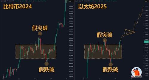
Price pattern comparison is a market analysis method that has low information density but is very intuitive, especially friendly for trading beginners.
Taking the trend in the chart as an example, many people will immediately think, "Ethereum #ETH is likely to replicate Bitcoin's upward pattern," which is very persuasive.
But the problem lies here: the more similar the patterns, the easier it is for people to develop a "confirmation bias," leading to impulsive entry.
I believe many people have had this experience: when looking at the chart, it seems too similar, and they jump in immediately, only to get shaken out; yet when you observe the market as a bystander, it actually follows a completely consistent pattern. This dissonance can cause a lot of anxiety.
So, how should this chart be understood? Especially, how should beginners use it? In fact, one sentence is enough—this type of chart belongs to the analysis category, meant to help you quickly understand what stage the current market is roughly in, rather than serving as a direct signal for making trades.

52,51K
Johtavat
Rankkaus
Suosikit


